|
I was working on the Spanish mural that Hailey has made for our school. I really really enjoyed painting the tacos and the pinata. Something that was very challenging with the murals is getting the paint to be even where you needed it, especially since there are holes in the brick wall. My favorite job of doing the mural was sketching the mural out, painting was fun but it was so stressful making sure everything was covered well. The effect that the murals will have on the school environment is bringing color to the Spanish wall since there is nothing there. 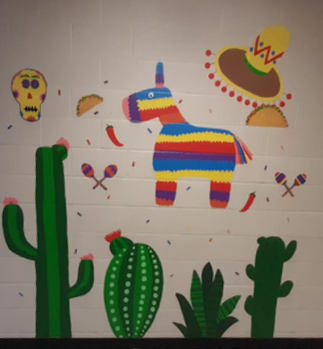
0 Comments
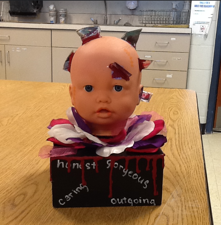
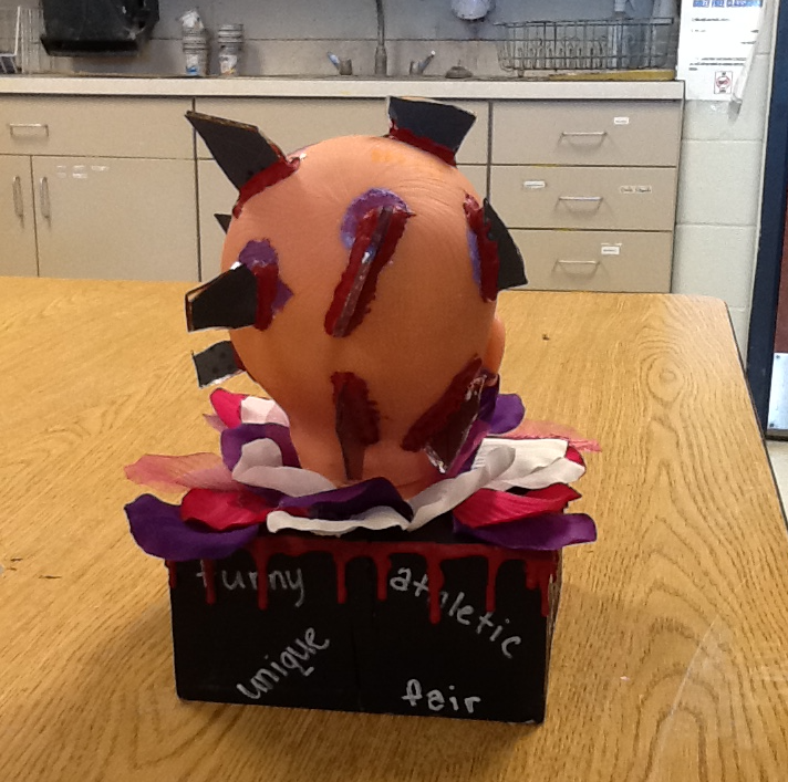
My assemblage sculpture is of a baby head being pierced in the head by glass with hateful and rude words. The baby's head is on a piece of wood painted black with pink, white, and purple flowers. There are words in white on the wood piece that describe the child, but the true words are being covered by blood dripping down the woodblock. This sculpture represents true beauty being hidden away by mean things people say to you, for example, bullying. The idea of my sculpture is that your words hurt more than you think they do. They can damage a person and the way they think of themselves. These insults can start at a young age and ruin the way that a person portrays themselves as they get older. I wanted to startle you by having glass inserted into a baby’s head leaving bruises, dried up blood, and scars. I think I was most successful at expressing my idea in a simple artwork. I thought that it would’ve been a lot harder to create but the idea behind it is a lot deeper than the artwork itself.
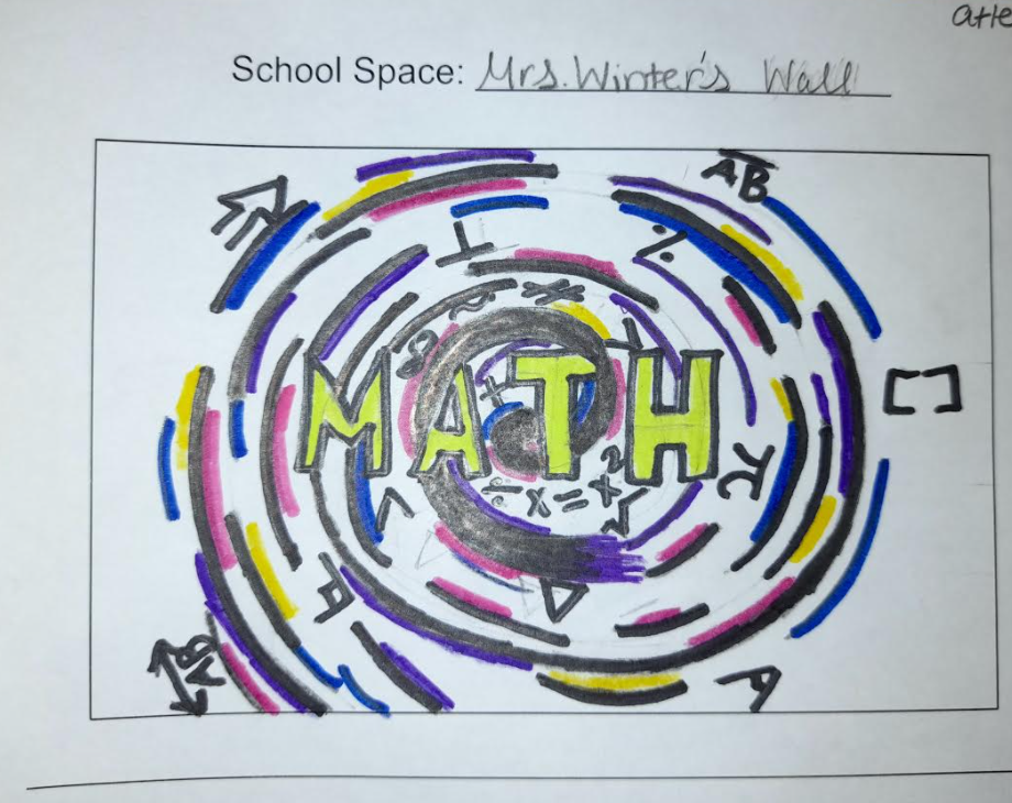
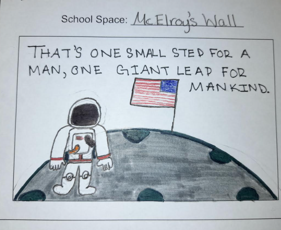
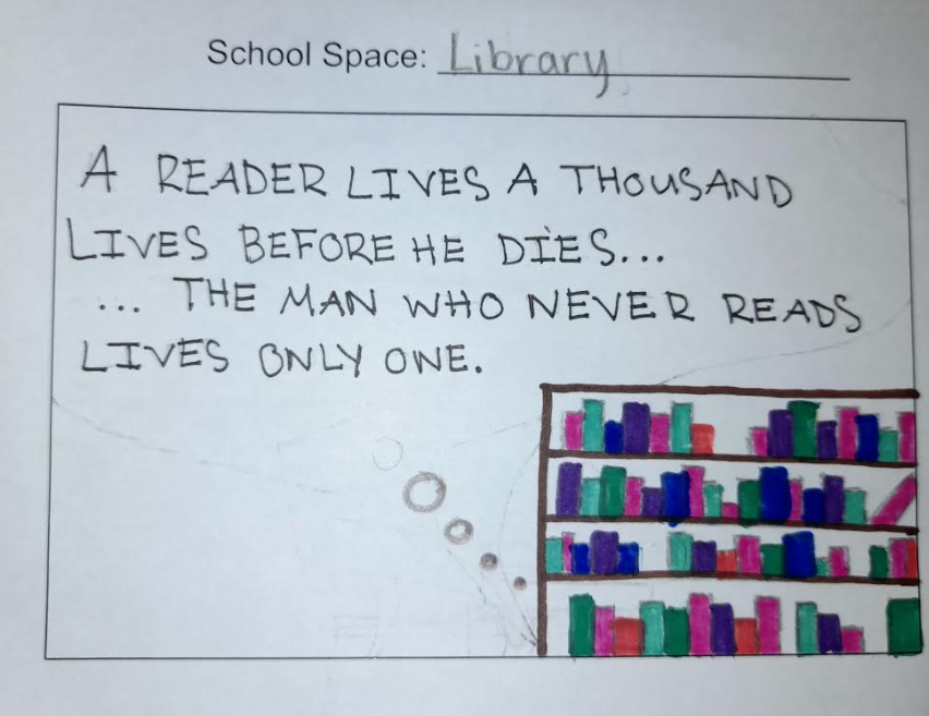
I would like to be improving the library, the math, and the history wall by adding a colorful mural to brighten up the spaces. The students walk past these places when they go to class and even enter into the classrooms. People who come and watch our concerts and games sometimes enter through these doors so they would see it. The mural by the library is mainly used to brighten up the wall since it is always very dark around there. The library space isn’t working the way it is because it is so dark over there in the morning and there's nothing over there to add a spark to the library, it looks very dull. The history space isn’t working because it is only the cream-colored walls there and I’d like there to be something that adds some brightness to the wall. The math space isn’t working because it isn’t bright enough and everyone walks past it every morning. It would also make our math teachers very happy.
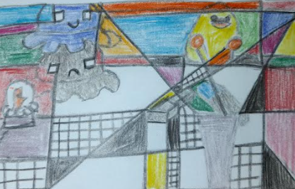
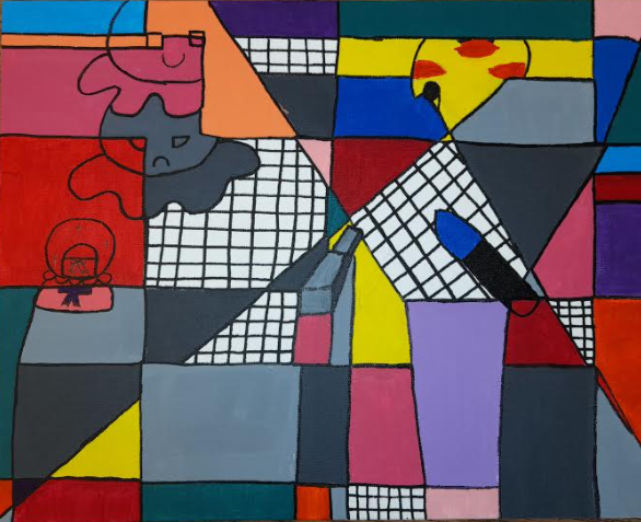
The style that I chose to do was cubism. I chose to do this specific style because I’ve never used it before and it was something different, I used the artist's style in my work by breaking up the objects by lines cutting through them. I also really enjoyed the bright colors that I inspired this painting. I chose to do a painting on a canvas because I want to learn more about it and it is very relaxing to me. The most difficult thing in this artwork was that I only got a week to do it since I was gone for a whole five days from being sick. When I came back to school I was really behind everyone else but I’m very glad I was able to finish on time without rushing too much. Something I am very proud of myself in this art piece was my patience. I was behind so when I painted it was a hard decision to do since I couldn’t exactly take it home and my patience with having the paint dry was better than it ever has. Overall I chose objects that meant a lot to me so this artwork is really close to me.
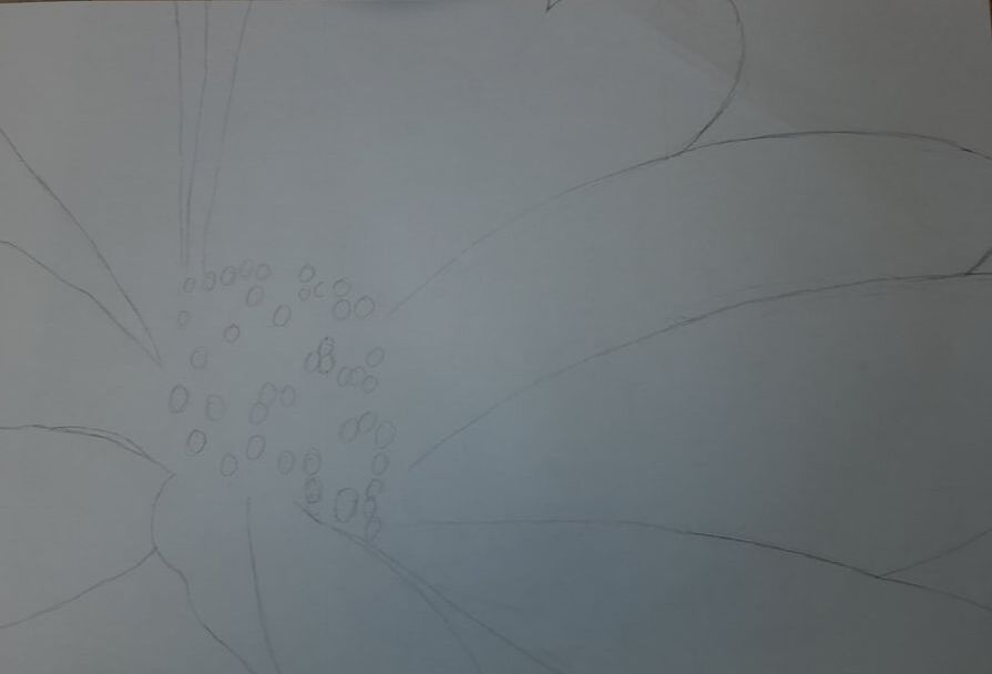
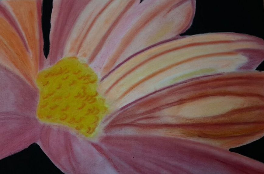
The travel place that I chose to paint was Greenville, South Carolina. I chose to do Greenville because it is something different and I’ve always wanted to go there. I improved my painting skills and patience with this artwork. I learned how to apply paint smoother and blend different colors to make a specific color. I really focused on my hearts on the trees as the leaves. I focused on this mainly because I wanted it to stand out more than anything in the painting. I also focused on the hearts because they were more of warm colors and the rest of my artwork was cool colors. The two major things that I am extremely pleased with within this artwork are my leaves and my sky. I really liked my leaves because they are mini hearts and I based the artwork off of valentines day. I really enjoyed my sky because I had nothing planned for it and it was last minute, but it came out amazing. Something I would do differently would be my bushes, I really don’t like the spiral design in them. I don't know why but it just throws off the artwork in my opinion. 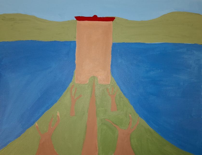 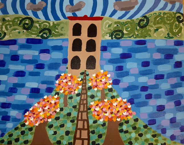 I chose these specific stencils because I really like butterflies, stars, and hearts. They are one of my favorite objects in the world. I chose to make everything look like it is coming out of the bottom of the middle and not just scattered across the artwork. One thing that I consider unique about my artwork would be the different variations of color that I used, even though they are just pinks, blues, and purples, I used different shades of each. My favorite pattern that I did was the little “v” shapes that I did with multiple different colors spread out within. Something that I feel like I worked on was my patience, I didn’t rush with this artwork like I tend to do with my other ones. 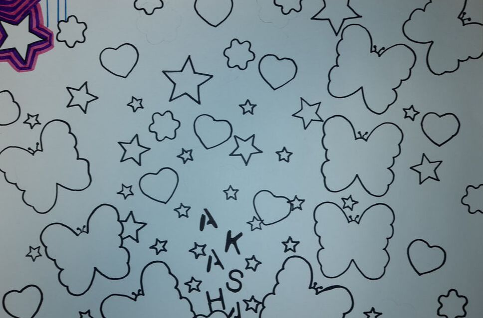 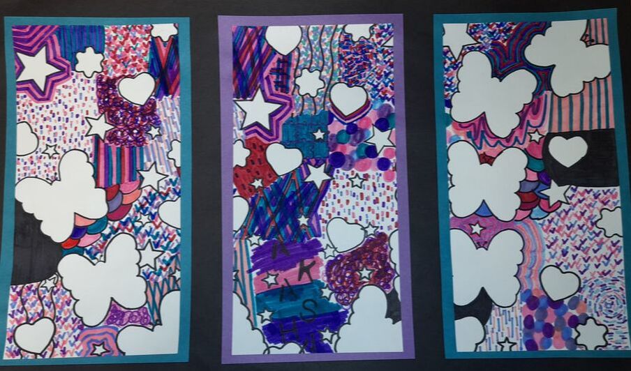 For this project, I decided to choose a flower that has a mixture of pink, orange, yellow, and purple in different shades. I chose a flower because it was something new and different. I liked the colors that the flower had portrayed. For my flower project, I chose to do chalk, since it is easier for me to work with, and it blends easily. Something that I learned when doing this project was patience and thinking outside of the box. When it came down to it, I had to be patient, test the color out, blend them to see if they looked and worked well together. Next, I had to think outside of the box when it came to positioning it because I didn’t want to be like everyone else, I wanted to be different. Although I don’t think I came off as different as I wanted I still really enjoyed getting my hands and clothes dirty making this gorgeous flower. One thing that I did find very challenging was blending the colors, throughout my artwork you can see where I did have trouble blending because the colors were on the opposite side of the color wheel. With the colors being opposite it did make it very hard to blend them. For example, my magenta pink and my dull yellow, that was a very challenging blend but I managed. Lastly, one thing that I worked hard on in this project would be putting the chalk on the paper in the right order and composition. My color theme was a bit different than what I’ve normally done since I don’t do many bright colors. The chalk was a little bit of a struggle since sometimes it wouldn’t blend the right way or had gotten on a spot where it wasn’t needed. I focused on the color of the chalk and the way it blended more than anything because I felt like that was the most important.
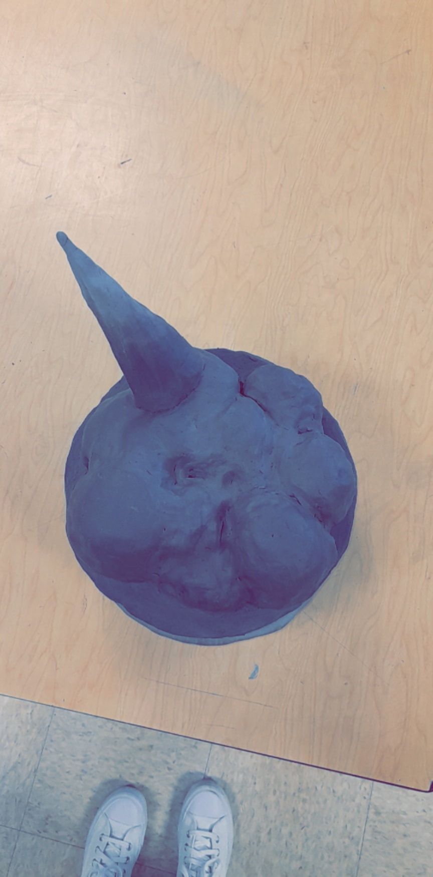
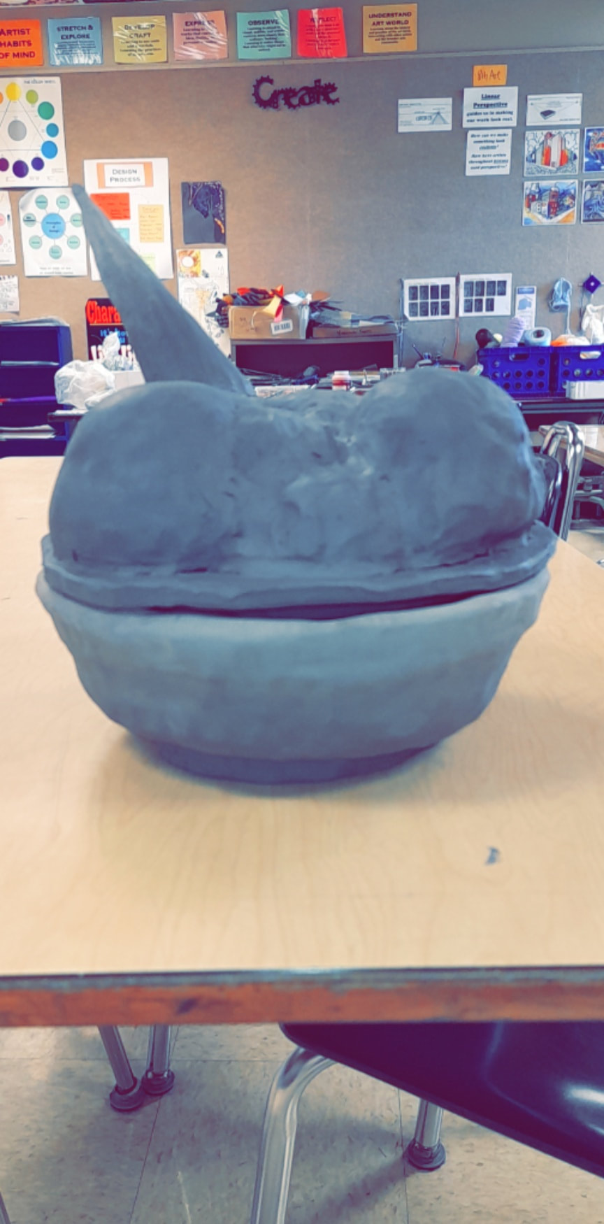
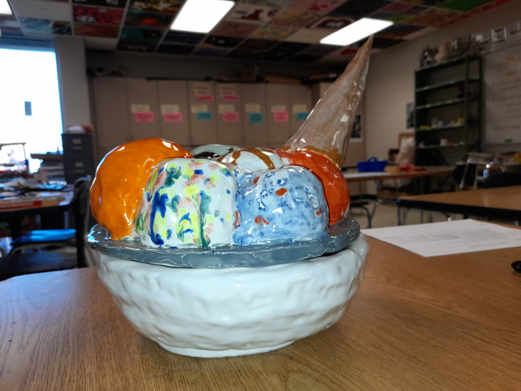
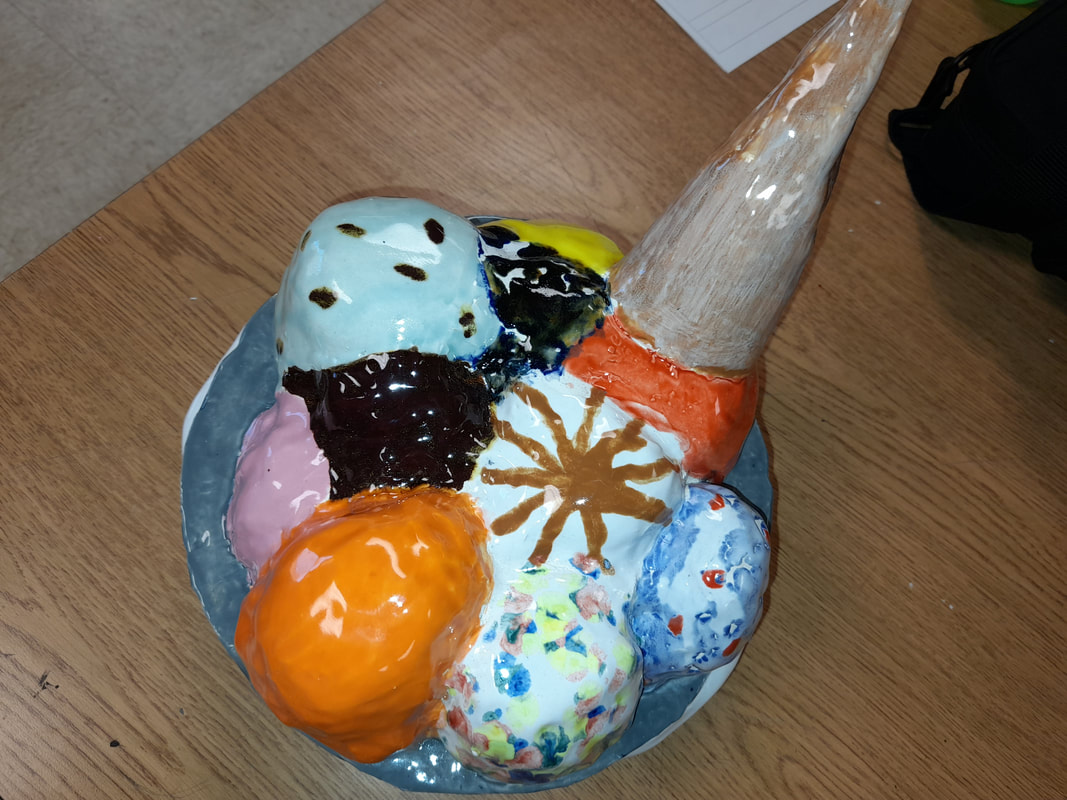
I was able to add unique ideas to my work by adding a baby swing on one of the trees. I also added a latter that helps you get up to one of the treehouses. I feel as if my drawing skills did improve a little bit. I do wish that I did spend more time on the tree instead of the houses and the outside activities. I did learn that I have to be patient when drawing and that I can’t rush it. I really focused on the texture of the tree, grass, and the treehouses in general. I focused on these the most because I wanted them to stand out more than the sunrise in the background. Some things I am really pleased with within my project are my grass and the treehouses. I’m happy with these because I spent the most time with them and added the most detail to them. One thing I would change would be the sunrise. I wish my sunrise wasn’t a sunrise, I would’ve liked the background to be a black night sky with stars, but it’s okay it still looks nice with the sunrise. Although I did wish I did the sunrise differently with the colors. I went from a light yellow to a dark yellow to a brownish color to bright orange. Which makes it throw off the whole sunrise setting and doesn’t match the rest of the vibe for the artwork. 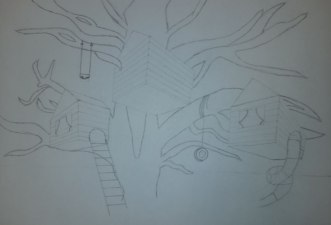 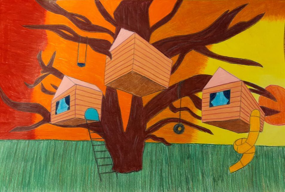 I chose to make a cookie jar. I chose a cookie jar because I enjoy eating cookies. I would say the thing that inspired me the most when creating my cookie jar would be ice cream. I chose ice cream because it is one of my favorite snacks to enjoy, especially on a hot summer day. I added an icecream cone to one of the scoops of icecream to make it look like it was dunked in the bowl. I did this to make it interesting, to add some height, and to add creativity. Some clay skills that I improved on when doing the project would be smoothing out everything, the coils and the whole bowl in general. One thing that I am most pleased about with my project would be how the bowl came out. I didn’t smooth out the coils all the way each and every time so I was a little worried about how it would come out. In the end after all the stress it did come out great. A challenge that I did face during this project would be the ice cream. I thought it would be easier, I won't lie about that, the scoops weren’t as good as they could’ve been but it still came out great. One thing I would like to change on my project would be the ice cream scoops. I wish I made them more round. I wanted the perfect standard of icecream for my project, which as we can see, didn’t turn out the way I wanted but it is okay. I will use my cookie for cookies of course, and I will put this in the kitchen with the other kitchen utensils to add a little something extra to the kitchen. I used multiple anime characters from One Piece, HunterXHunter, Attack on Titans, Bleach, Naruto, and Manga. I chose all of the main characters from each show so they would be easier to spot out. My project is unique and creative because it is close to me. I enjoy all types of anime, and I really did try to express that in my artwork. I hid a lot of objects in my artwork to throw people off. The only ones that you need to find are a pencil, a blue can, a green eye, and a piece of candy corn. I created this project by hand and I drew it out myself. It took a lot of time and work but it came out amazing in the end. I am really pleased with how well my characters came out since I did draw them all out by hand. Although I did not color all of the characters the exact colors that they were originally, I made them more bright and upbeat. There are a couple things that I am not satisfied with in my artwork. I am not happy with how the colors came out after I colored it, I wish that I did not color it but mistakes happen. 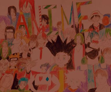 I spy a blue can on top of a man, a pencil instead of a stencil, a piece of candy corn not a thorn, a green eye that cannot lie.
|
AuthorWrite something about yourself. No need to be fancy, just an overview. Archives
November 2020
Categories |
 RSS Feed
